THE VENETIAN POKER ROOM
The Situation
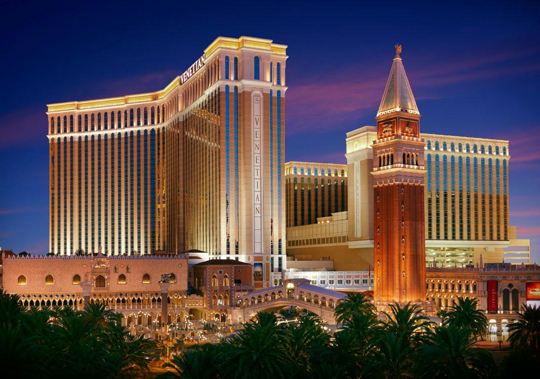
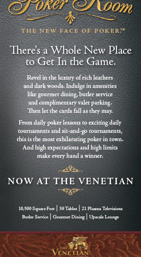
- In 2006 The Venetian Resort was jumping on the popularity of Poker, however, they wanted to set their poker room apart from the rest
- In true Venetian style, they wanted a poker room that was classy, upscale and elegant but they also knew the demographic was a bit trendy and edgy
- They approached ERC to develop the poker room brand, as well as an opening launch campaign that would attract “serious players”
Strategy & Positioning
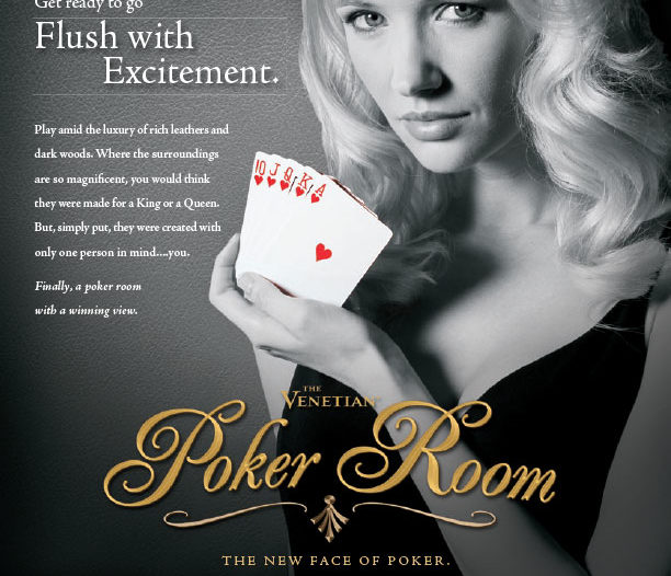
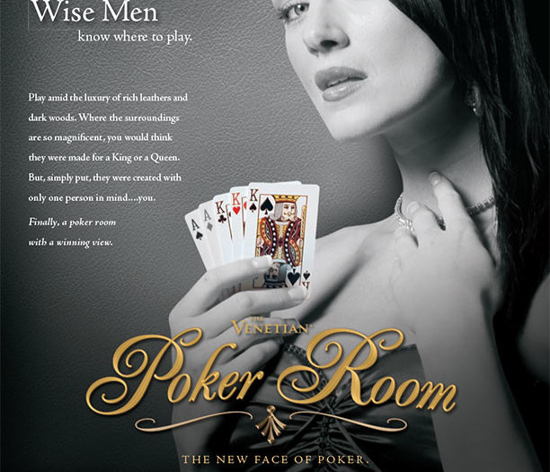
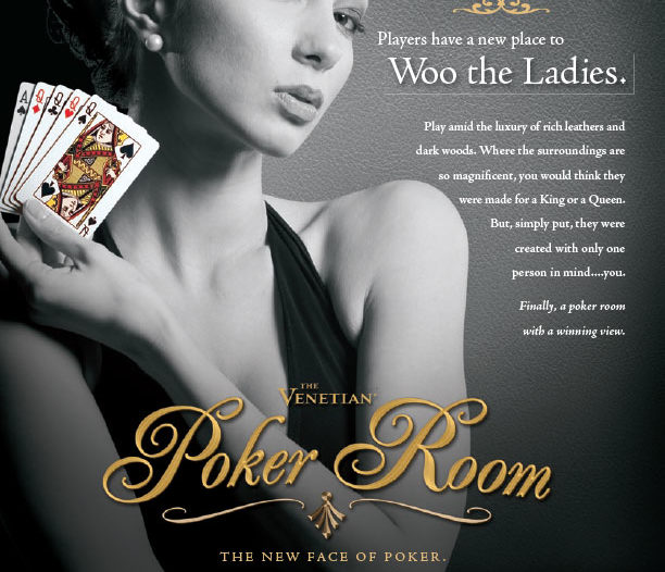
- Research and development proved that there are many hidden terms and “lingo” within the poker industry
- These are terms that many times only real players know and are familiar with
- We wanted to develop something that spoke to these “real players” and would catch the attention of the predominantly male demographic with class and sophistication
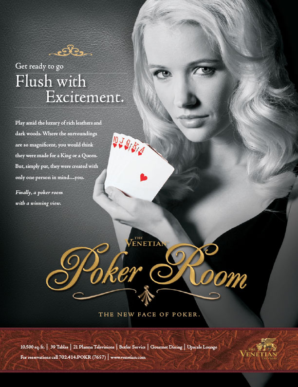
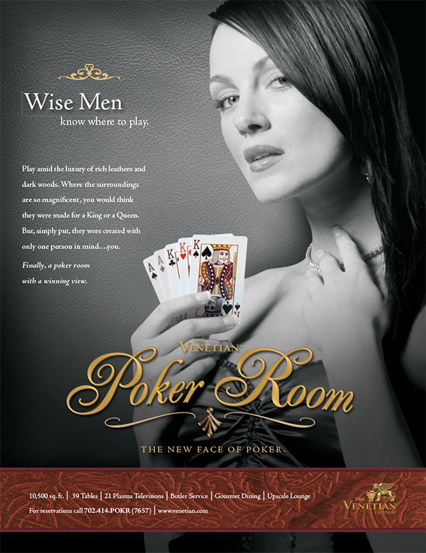
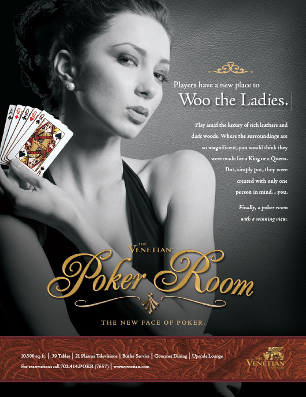
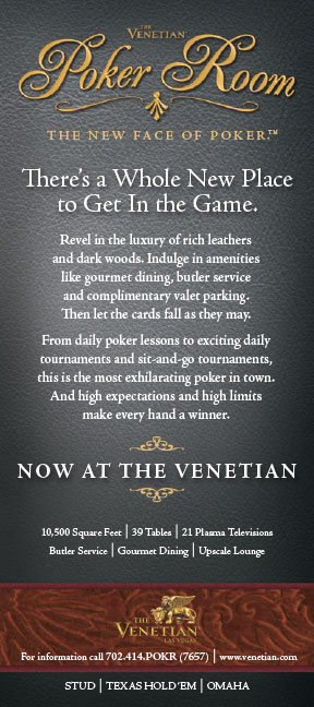
Execution & Results
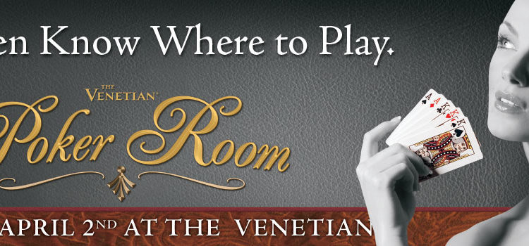
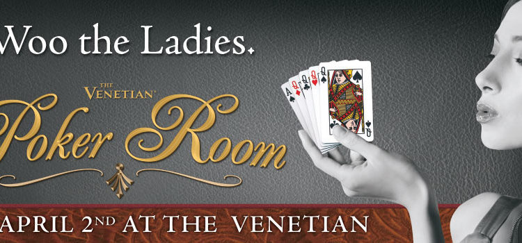
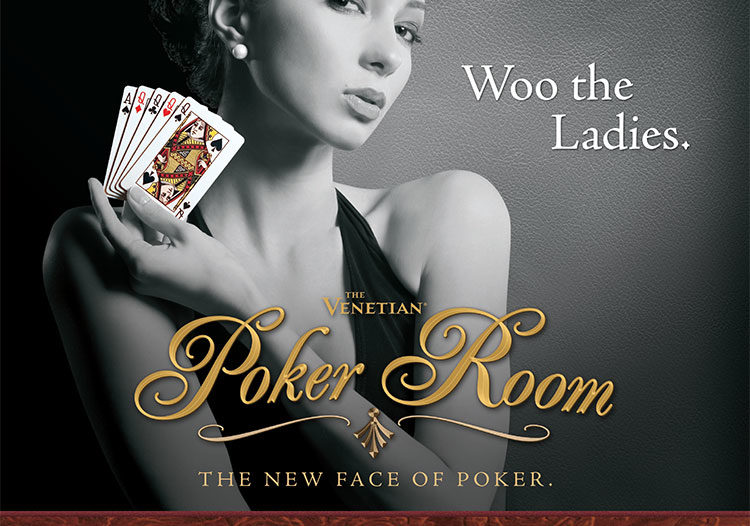
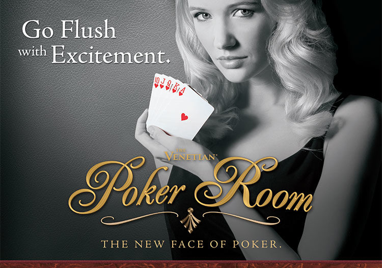
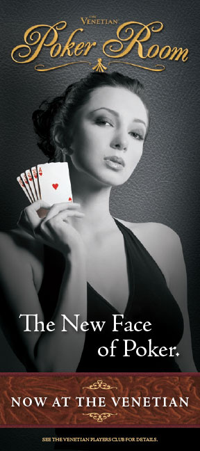
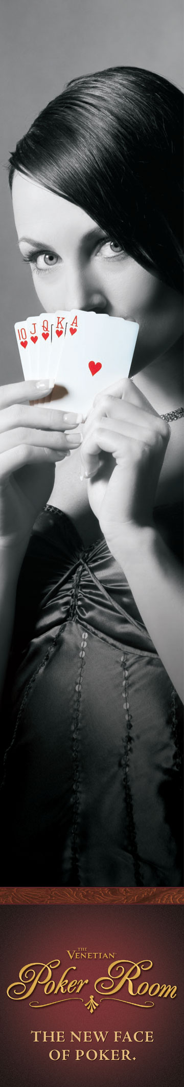
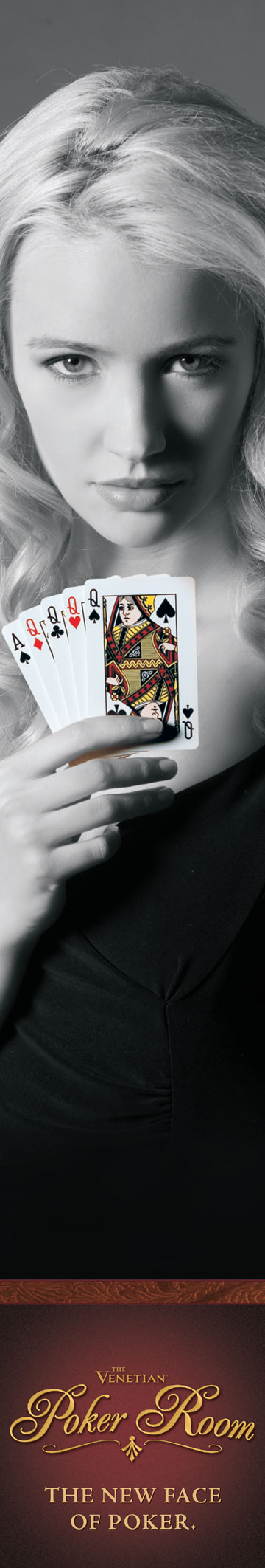
- We chose to go with a predominantly black and white
campaign, to distinguish the Venetian Poker Room from
the other Poker Room brands that were flooding the
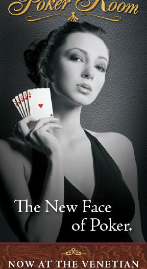
Las Vegas market at the time. - Witty, intelligent positioning lines were chosen that
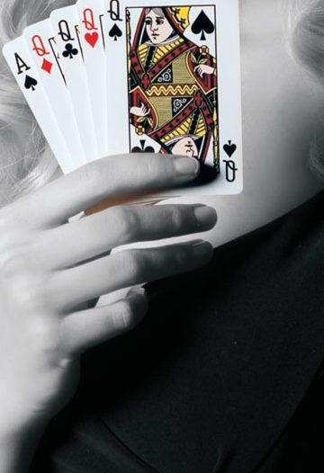
spoke directly to the serious poker player. Seductive, sexy,
yet classy female talent was cast and photographed
holding card hands that further supported the headlines
on each advertisement. - A logo and image was developed that was in keeping
with the upscale and sophistication expected of
The Venetian Resort


